
Color is a choice, not a science.
Color is a choice, not a science. Certain colors make you feel certain ways. Reds are exciting; blues and greens, cozy and relaxing; yellows – bright, breezy and full of life; blacks and greys, sexy and teeming with sophistication and mystery. Most people shy away from too much drama in color when choosing furniture; going the safe route into time-honored beiges/browns and greys. Why? Why this innate fear of color? Well, for kick-starters, while a particular color might be your favorite (mine’s red) many people wonder whether or not they can sincerely live with it for more than five minutes. The answer is ‘yes’…and ‘no’ – depending on your personality and level of comfort. So ask yourself…
Are you the type of person who gets bored with your decisions quickly?
Does the idea of adding color to any room in your house scare the Ralph Lauren out of you?
Do you constantly second guess every decision you make?
If the answer to any of these questions is ‘yes’ then my sincere answer to you is ‘get over it!’
Life’s too short to wander through a series of monochromatic rooms in the place where you spend more than half your natural life. Think of it this way; when you go out in the world your eyes are inundated with ever color in the spectrum; plums, ocher, emeralds, robin egg and sky blue, velvet grey, fire engine and candy apple red, sunshine, lemon and mustard yellows. The list goes on and on. My point; color is everywhere. So why prevent it from entering your home?
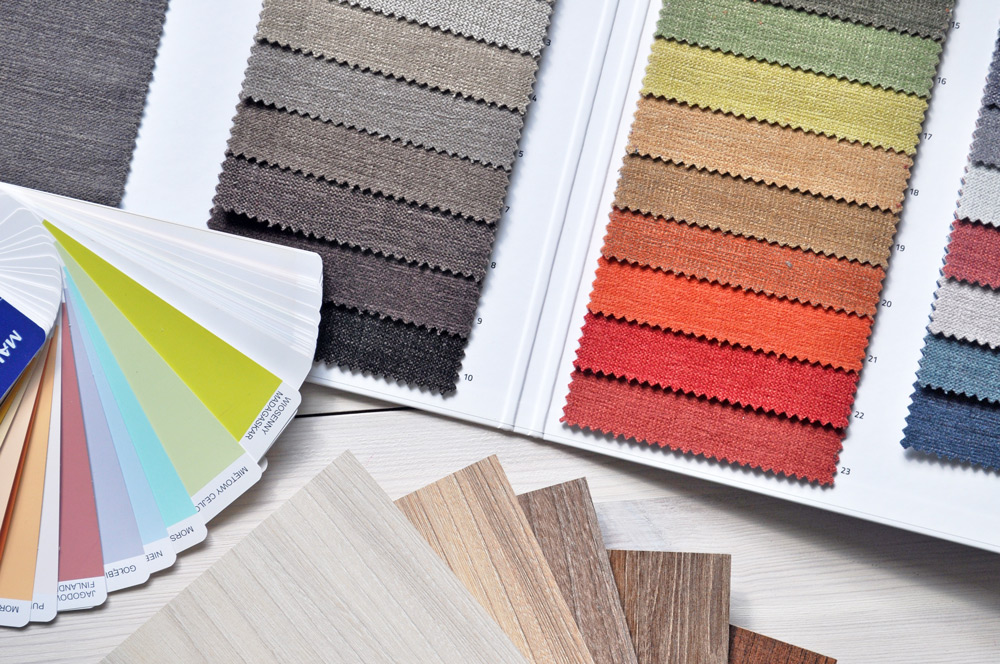
Now, not every color is meant to ‘go’ together.
Now, not every color is meant to ‘go’ together. So how do you discern between the ones that do and those that clash? Well, you’re on fairly safe ground if you start with a monochromatic choice and build your collection out from there. Greys, for example, go spectacularly well with yellows, navy, reds and oranges. But depending on the shade, they may not be such a great fit for greens, browns or coppers.
It’s always been a curiosity that because today’s potpourri of eclecticism there are no entirely right or wrong answers most people still tend to worry theirs will be the epic faux pas to expose their untrained designer shortcomings. While we have all seen our share of ugly accoutrements thrust together in that cluttered bric-a-brac way that positively reeks of amateurism (some, briefly celebrated and even championed by leading designers as a ‘break out’ from under the shackles of tradition); there is certainly nothing wrong with clever experimentation, so long as you have some basic guidelines to follow.
Baring a clear case of amnesia, you already know what you like. So start there. If you hate the color ‘red’ then don’t let any designer tell you it’s the color du jour you should be contemplating for your new chaise, wingback and ottoman…because you won’t hate it any less once those pieces are in your living room. However, if you absolutely love hot pink, but think it will make your bedroom look like some South Beach, Flamingo-ed, Golden Girl’s knock-off hosed down in Pepto-Bismol; don’t hesitate to approach a professional for advice on how to make ‘hot pink’ work for you in the space you have in mind. Because it is doable! Most everything is – within reason. A good designer, even a good furniture sales consultant can make most every color click as it should. Better still, they can offer up a palette of colors that will ‘go’ with hot pink; greys, winter whites, soft yellows, navy and sandy browns among them. So you haven’t boxed yourself into a corner or made a ghastly mistake that will continue to haunt you in perpetuity…or until you can afford to junk your foray into boldness and run back to your boring beige.
Find a Color Theme.
Find a color theme. You wouldn’t, for example, want to paint your living room jet black and the room next to it pumpkin orange. It’s a color clash not a color match. But colors most definitely can and do flow into one another. To narrow down your possibilities, start with the color you absolutely cannot live without. Then, grow your color odyssey out from there. A great compliment to my favorite color – red – is grey; also black, the right kind of brown/taupe and navy. So, color flow can come from seguing from room to room, exploring and introducing different accents to offset and keep the flow moving from room to room, instead of remaining stagnated in a tradition of the same colors over and over again.
How about a winter white living room with a cherry red accent wall to show off the fireplace? Follow it with a gunmetal grey kitchen with white cabinetry and black granite counter tops. This could open onto a light feather grey family room with a dark navy accent wall behind your titanic 75 inch flat screen? Nothing wrong in introducing mustard yellow accent cushions here, or a royal blue sectional and wing backs; and maybe some brushed nickel or pewter accents and silvery-blue art work, or retro B&W art prints.
Window coverings? Depending on the height of the windows, how about some warm white shutters, or creamy and/or velvety side panels in a complimenting tone.
The point is that color is a journey meant to be experienced, the resulting destination hopefully leading to more possibilities than limitations. Finding a way to make all of your favorites work together is a challenge – not a hurdle. So be creative. But trust in testing your boundaries.
Expand your comfort zone.
Be positive and stick to your choices.
Above all else…love what you have achieved and spend the remaining hours experiencing the initial excitement of putting these colors together over and over again each time you step into the oasis of color that you have created. Good hunting. Have fun…and prepare for great things.
Thanks for the great article and good advice.
I’ve never had the opportunity to visit your store, but am looking forward to doing so in the future.