Color: it’s such an intimate decision.
It says so much about ‘who we are’ and ‘how‘ we choose to live our lives.
Not surprising, with all the colors of the rainbow at our disposal, discerning which colors go together, not to mention making the initial executive decision about ‘the’color, to mark a room with our distinct personal signature and design aesthetic, can be a very daunting task. Consider it a challenge then…or in this case – a challenge resolved. Because we have come up with some supple and stunning choices that are universal, timeless, eye-catching, and above all else, can really deliver that ‘wow’ factor in a room with just a little bit of creativity factored in along the way.

As with any design aesthetic, when it comes to choosing your base color (the one from which all others in the room will take their cue), there are no steadfast rules; no ‘right’ and ‘wrong‘ but rather, tonal variations of gray – or blue, or pink, or…oh, heck; let’s just get started and find you the color that will make all your design dreams come true.
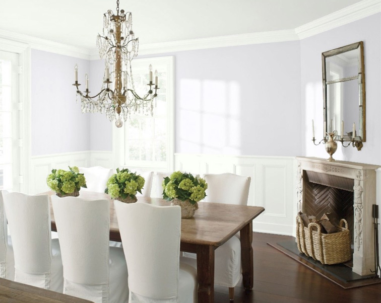
White Opulence
For openers, there’s white. Boring, you say?
Au contraire, mon Amie. Benjamin Moore’s White Opulence (OC-69) is a neutral. Because of this, it has acquired the reputation of being a failsafe or designer’s cop out; the ‘go to’ when you fear a major fashion faux pas. However, in addition to white’s properties exalting the look of cleanliness at a glance, White Opulence can also bring about a renaissance in your home décor, especially when paired with metallic golds to give the room that essential glam-bam.
Want a less flashy result? Try neutralizing the effect with a ‘tone on tone’ approach, employing varying textures in your fabric choices to go from flat to flair and fabulous in the twinkling of an eye and without all the head-scratching as you navigate your way through additive color choices. A room done in neutral white with textured plush or shag area rugs, not to mention white on white tweeds, cross-hatch stitching, rugged homespun woolens, etc. can help to anchor your central design philosophy while illustrating a fresh new approach to a tired old living space. Also, do not be afraid to experiment with varying shades of white. There are quite a few. This will add dimension and interest to your room.
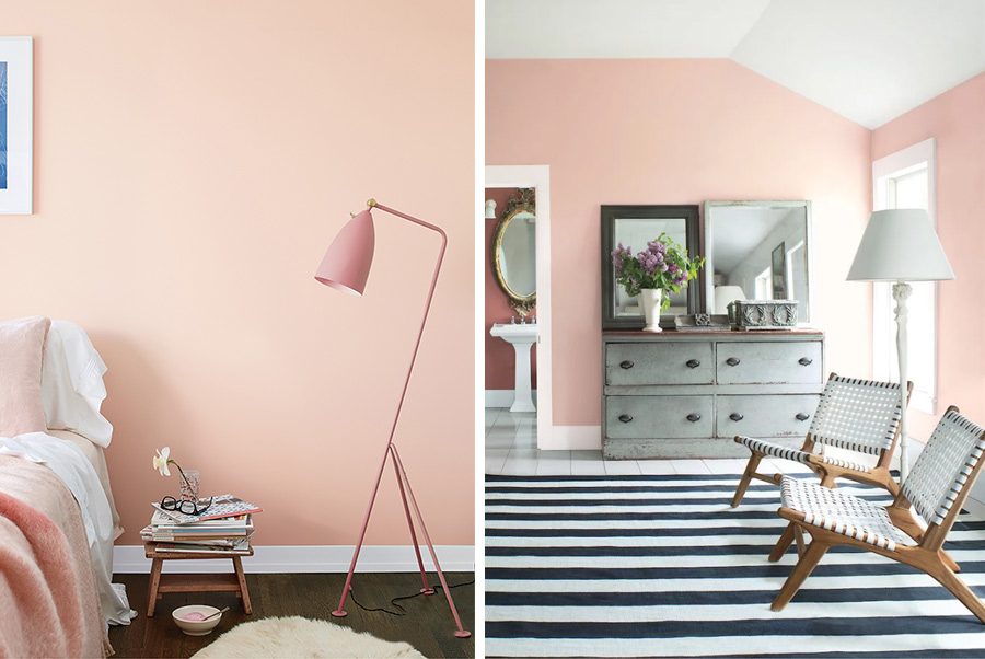
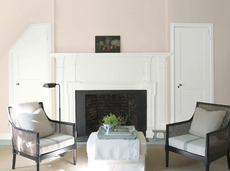
Pleasant Pink
Need further consideration? Why not try Benjamin Moore’s ‘Pleasant Pink’ (2094-60)? Like white, pink gets a rather bad rap for being either too frilly and feminine (as in suitable only for a little girl’s room) or too loud and obnoxious (as in pink flamingo gaudy to Golden Girls’ pastiche with a shade of Mexicali bordello thrown in for good measure).
Well, you can sincerely set aside these misconceptions about pink in general, and ‘Pleasant Pink’ in particular. Here is the adult version of pink you have been searching the world over to find. The versatility of pink has grown in designer circles and for very good reason. Done with an ounce of character and a touch of class, pink is an uncommon, though hardly impractical color to reference invigorated thoughts of spring, enveloping the soul in its soft, fleshy allure.
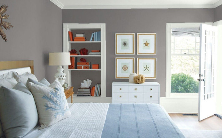
Excalibur Gray
On the other end of the spectrum is Excalibur Gray (2118-50). It’s no secret. Gray has been the ‘go to’ fav’ for more than a decade now, suggesting urban chic and discriminating sophistication that is as equally comforting as warm flannel on a snowy or rainy afternoon. We’ve all heard about ’50 shades of gray’ but actually it’s more like 500+, with a tone just right for whatever the occasion demands. Gray is an amazingly versatile neutral, with more depth than its albino predecessor and an air of urbanity that straddles the color chasm between virginal white and tuxedo black. A real class act, and a very tough one to follow.
Dreamy Cloud
Dreamy Cloud (2117-70) is another derivation of traditional white. It thrives on the sparkle and sensational cleanliness of white, creating the illusion of a much bigger and brighter space. You can use ‘Dreamy Cloud’ in small or large rooms to achieve a look of serenity and a really pristine and gorgeous backdrop, suitable for all the highlighted drama the rest of your home furnishings will allow.
Smoked Oyster
When it comes to neutrals, you must love Smoked Oyster (2109-40). A delicate blend of white/beige, with a subtle hint of pinky/grey, Smoked Oyster reveals something new to the casual visitor each time they enter the room. We love, love, LOVE Smoked Oyster for all the peaceful serenity it draws upon and even better still, the tranquility it breeds, cleansing the eye of any distinct color choice while lending itself to multiple interpretations along the way.
Peau de Soie
Benjamin Moore’s Peau de Soie (AF-60) has been a staple of the company’s paint chip technology for quite some time. Why? Well, for starters, it serves as a timeless twist on beige. Beige is always being blamed for being ‘boring’; the unloved and ‘red-headed’ stepchild of the paint industry. But beige, like white, can either be boring or bodacious. The trick here is to choose the right beige for the job and they quite simply do not come any finer than Peau de Soie; the perfect compliment to so many different colors it has proven its merit whenever and wherever it is used.
Stone
Second to last on our pick of favs is ‘Stone’ (2112-40). Gray is one thing. ‘Stone’ is quite something else; a variation on a theme that has yielded a lot more than just another gradient of the color spectrum. Stone compliments the natural earthy tones of life and is the perfect backdrop to your otherwise monochromatic color scheme, pulling on grey tones in rugs and furniture. Remember, wall color is a backdrop or, if you prefer, a prelude to the magnificence of artwork, accents and other home furnishings set before it. Need to make a statement without drawing undue attention? ‘Stone’ is the color for you. It says something without saying too much!
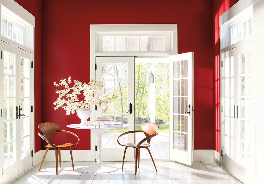
Caliente
Finally, at the opposite end of the spectrum there’s ‘Caliente’ (AF-290). ‘Caliente’ is the sideshow red that knows it’s the whole circus. Red has gone through a history more illustrious and tainted than most every other color. For starters, it was the original choice of royalty and the church, the latter having forbade anyone but the nobility and clergy to wear it. Red is also the very first color the human eye is drawn to at a glance. So, if you want to make a powerful statement in a room – red is your hot and spicy ‘go to’. For some time, the fast food industry has taken its cue from red walls – invigorating their clientele to spend more at the checkout. Santa Claus knew a good thing when he saw it.
And consider this; there isn’t a flag or a sports uniform out there that doesn’t find some way to sneak red into its power-brokering empires and competitive spirit. So, Caliente really says something about you. At home, Caliente is a great color to blend into dinettes, eating nooks or even formal dining rooms, accented by white or off-white to cream trim. You can use red in virtually every room in the house – save the bedroom where more tranquil colors are generally preferred to promote rest and relaxation. But red is a party unto itself and its never stingy. It invites you to get up and take notice, generating warmth, pop and the ‘wow’ factor, even when used sparingly for accent walls.
So, there you have it, folks. Our color choices for the upcoming 12 months in 2018. Whether you go soft and unobtrusive or pursue a more invigorating path when exploring your own creativity, these choices will virtually guarantee to excite and ignite the senses. The color wheel is definitely turning towards a diverse palette this year that will inspire you to make your home the very best that it can be. Enjoy the hunt. Relish in the discoveries. And live and bask in the moment of a luxurious place to thrive and be celebrated in 2018.
![]()
ROBBY LYNN YOUNG
PAULETTE NICODEMO
CINDY CATTON
519-977-9998